
HOW TO SELECT HOME COLOUR SCHEMES
* Tips For Choosing Colors For Room Painting Makeovers
Before buying paint for redoing rooms in your house, make sure your chosen colors work are suited for each room slated for a makeover.
Just by choosing the right color schemes, you can turn an ordinary room into an exceptional one. But before dashing off to buy paint, be sure to do choose colors that will work well for each room.
Take Inventory
Know what you have to work with regarding your present furnishings. Go throughout your house and determine which areas need a major makeover. With a notepad and pen in hand, write down pertinent information regarding each room.
Consider Lighting
What direction does a room face? Does it face east where morning sunlight streams into a window? Don’t use dark colors in rooms exposed to a lot of sunlight. A room facing east won’t appear the same in the evening when viewed with artificial lighting. Rooms facing west may have a warm glow in the morning, but will be dull in the morning. Just take this into consideration when selecting colors.
Also, keep in mind that rooms facing north receive less direct sunlight that those that face south. Therefore, you may want to use sunnier colors to cheer up a northern exposure.
Take home a wide variety of paint swatches. Then note how the various light sources for different rooms work with the swatches. Before investing in any paint, put up a test patch on your wall. After three days to a week of seeing how the light hits the wall, you’ll have a better idea about how the room would be if painted in that color.
Choose a Color Strategy
What sort of mood do you wish to convey with a color scheme?
Monochromatic design –A monochromatic color scheme is one where there is one basic color, giving a room a harmonious mood. However, a variety of shades and hues (from light to dark) are included, resulting in a good flow of the room. For example, a fashionable monochromatic scheme for today is one in which shades and tints of green are used.
Complementary design – On the other hand, a complementary color scheme applies complementary colors that are on the exact opposite end on the color wheel (such as blue and orange.) This affords more license for using lots of accents and highlight colors. Just make sure you manage your complementary colors so as not to make them too grating.
Analogous design – When you use adjacent colors on the color wheel, you’re creating an analogous color scheme. Some home decorators choose this type of color scheme because it gives them the chance to use lots of dramatic highlights. As a caution, stay away from too much of the analogous colors of red and orange as this may be too bright for you or your house guests..
Balancing Colors
When working with more than one color, it’s best not to have equal proportions of each color. In other words, allow for only one dominant color. For example, your walls and flooring could be in a green tint. For a sharp contrast, use the complimentary color of red. Perhaps you could paint one of the closets red. Then include a red piece of furniture, such as a chair or couch. Arrange shades of red and green pillows. On shelves be sure to have some red knick-knacks to pick up on this secondary color.
Also, don’t use two colors that are of the same intensity and strength as they’ll compete against each other.
Finally, remember that colors are personal choices. Although you may love a particular color scheme, others may not be so excited. Its fine to get advice, but the final choice is yours.
1. A great place to look for color inspiration is your closet. Chances are that when you go shopping for clothes, you are picking colors not only because they look good on you, but because those colors make you happy. Take a peek and see what color is predominant within your wardrobe. What colors do you pair together in your clothes? If the colors look good together on you, they will look great together in your room.
2. Maybe you have a piece of art with some vibrant hues in it that can be incorporated into your space. Or perhaps your grandmother gave you a lovely vase in a pleasant tone that can become the main focus of the room. Look at things you already have to develop color ideas, and when you design the room you won't have to buy as many great color accessories...you already have them!
3. Finally, if inspiration is just not coming to you on its own, try picking up a few design magazines. Relax in your favorite chair and flip through the glossy pages until you find a photo of a color scheme that really speaks to you.
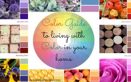
4. Once you have at least one color that you want to focus on, go online and download and image of a Color Wheel, or pick one up at a craft store in the painting section. The Color Wheel is a basic tool for learning how colors can work together:
• Monochromatic Scheme: Just like it sounds, a monochromatic scheme uses just one color. But don't be fooled, monochromatic is definitely not boring; yes, your accents will ALL be green, but you can mix and match different shades of green. What makes a monochromatic scheme work is the use of varying shades of the same color whose tones go well together. EXAMPLE: Pair a lime green with a kelly green, as they both are vibrant shades. Try working with sage and accent with pale pea green; these softened tones go well together. And, no, using a monochromatic scheme doesn't mean that EVERYTHING would be green. Monochromatic schemes work best with a nice neutral base, like grays, browns, beiges....you get the idea.
• Complimentary Scheme: Colors exactly opposite each other on the Color Wheel are complimentary, and when used together, they create the greatest amount of impact because they are polar color opposites. Using a color with it's compliment will make both colors pop and add a lot of visual interest. EXAMPLE: blue and orange, purple and yellow, red and green.
• Analogous Scheme: Colors that are next to each other on the Color Wheel are considered analogous. They go well together because they share similar elements in their color makeup. EXAMPLES: red and orange are both warm tones, while blue and green are cool shades.
• Tertiary Scheme: Three colors that create a triangle on the Color Wheel can make up a tertiary scheme when they are spaced equal distances apart. These colors create a great amount of contrast when used together. EXAMPLES: Red, yellow and blue, or green, orange and purple. If you don't like one of the colors from the triangle, you can toss it and make a scheme of your own. Not a fan of orange? Try just the chartreuse green and lavender together, and they will still look great.
5. Don't forget the neutrals! While they don't technically live on the color wheel, neutrals are great with any color. Because they provide a clean slate, they can create a perfect background for your main shade choices to really stand out against. But even neutrals have undertones to pay attention to when matching up your scheme. Grays tend to feel cool and go great with blues, but they also look great with hot colors, like red, that contrast with that touch of coolness. Beiges feel warmer, so they naturally look great with other warm tones, but the right shade of a cool color looks great with beige too. And the neutral of the moment is chocolate brown, which seems to go fabulously well with almost anything. Just make sure when choosing your neutral shade that it has a lot of contrast with those accents; if you have dark accents, choose a lighter neutral and vise versa. The exception: really bright accents will pop off of any background.
6. Once you have and idea for your color scheme, take your inspiration to the hardware store & match up a few paint swatches. When it's time to go shopping for furniture and accessories to fill your space, you can break out the swatches so that you can get the colors just right.
A kitchen’s color sets the mood in the kitchen. It makes the room either alive or dull. It also makes the room look either cramped or cozy. In some instances, it also creates in the persons using it a feeling of either excitement or boredom. Thus it is really important for you think of the color of your kitchen to give it a positive aura. Here are some kitchen color schemes to guide you in designing your kitchen.
If you are not a very adventurous person, the least risky of the different kitchen color schemes is monochromatic. Using only one color creates a clean effect. You don’t have to worry if colors complement or contradict each other. Commonly used colors are white, peach and yellow. If you want it to have a little ‘accent’, you can use one color in different hues.
For a classic look, one of the best kitchen color schemes that you can use is the neutral scheme. Commonly used colors are gray, cream and tan. If you want it to become a bit edgier, you can use the accented kitchen color scheme. In this scheme you still use the neutral colors as the base color but you add lighter ones to accentuate it.
For a spunky look you can use the complementary color scheme. In this style you can use two complementary colors to make the kitchen really alive. Two bright complimentary colors will add more life to the kitchen. They can lift up the mood of whoever is going to use the room. However, too bright complementary colors can sometimes add stress to the user. If you want to avoid this, you can opt to use two light or less bright complimentary colors.
These kitchen color schemes are the usual schemes used in painting a kitchen. But remember that you can always freely use your creativity to make the kitchen more exciting to work in.
Choosing a Color Scheme That Fits Your Personality
When decorating a room, it it important that you choose a color scheme that fits your personality. Not only will it be a better way of reflecting and expressing who you are, but it will also make you feel more comfortable in the environment as well.
It is no secret that different colors are associated with different moods and feelings. For example, the color white is often associated with peace and tranquility while the color red might be associated with passion or urgency. When designing a room you will want to make sure that the mood reflected by the colors is one that you want to feel and express in your decor.
Below are some tips for choosing the right color scheme for you:
1. Learn What Different Colors Mean: It is very easy to learn what colors mean. Chances are you may even be able to come up with your own associations. Ask yourself what you think of when you think of each color. Does red make you think of love? Green make you think of nature? Do you think brown is relaxing or boring? Your own personal definitions of what colors mean to you will be the most important, though you can also research color symbolism as well. Note that the color used in a room can change the mood of that room and also change the optical appearance. Below are some color characteristics that will help you decide the mood and optical effect of the you want to create in a room.
GREEN- It is known for its soothing effect, it is a secondary color that is gotten when blue and yellow color is mixed together in equal proportions. The color is linked with anything that has to do with nature, it gives the room a feel of nature, a tint of green (green mixed with white) tends to make the room lively and playful- most people prefer to use this color for the children’s room.
BLUE- This is a very cool or rather cold color that produces or creates a calm effect- it is easy on the eyes and gives the room a cool feel. A lighter shade of blue like sky blue gives a room a clean fresh look while the dark shades gives the room a regal look and makes the room appear larger.
RED- is a warm color, most times it is hardly used in its pure form because of the hot effect it creates in a room and for the fact that it signifies danger and excitement. So often it is toned down with white to create lighter hints- like pink to make the effect less aggressive and cool to the eyes- other colors that can be created from red includes burgundy, maroon red- which gives the room a rich effect. It makes the room seem small.
YELLOW- is warm and cheerful, it has a striking and joyful effect- lighter hints of yellow like cream and butter colors- creates a refreshing and luminous sunny feel.
Grey- is a neutral color- it is gotten when black is mixed with white in equal proportions; it can be used to tone down color schemes.
Most interior designers say that pale colors as well as warm ones makes the room seem bigger while the darker colors including cool ones gives the room a smaller look-
Here is how to use color tones to transform the optical appearance of a room.
The use of the same color tone to paint an entire room; it preserves the proportion or size of that room. When a light color is used, the room will look bigger than when a darker is used.
Using a dark color for part of the wall in a room- makes the wall seem to advance- this effect can be used for rooms or corridors that are narrow and long.
Where all except a part of the room is painted with a lighter shade of color- will make the wall appear to recede as in shift back optically. This effect is used often when a room seems box like.
To make the ceiling appear lower, paint it with a dark color- this effect can be used in rooms where the ceiling appears too high for the dimensions of the room.
2. Consider the Function of the Room: The use of the room will greatly shape what type of mood or feeling you want to create with the decorating aspects. For example, in a bedroom you may want something that is peaceful and calming. In a living room however you may want something that is more vibrant or bold. Often times if you pair the mood you want the room to evoke along with your definitions of the colors as outlined in the previous tip you can easily choose the right scheme for you.
3. Choose Complimenting Colors: There are three different basic color complimenting things to consider. These are monochrome, contrasting, and analogous. Monochrome would mean that you stay all within one shade. For example, you might have dark blue carpeting but light blue walls. Contrasting is when you pick opposites of the color wheel, such as pairing blue and orange or red and green. Analogous colors are those that are closely related, for example blue and green or red and orange. When you stick to one of these basic principles you really can't go wrong!
These three very simple steps make it very easy for you to choose a color scheme that meets your personality and individual style. When you have the right colors in place you will be able to not only express your own unique self, but create an environment that is comfortable and the most suitable for you and your needs.

Connect With Us
 |
 |
 |
 |